Quick answer: what this site prints
Why the worksheet should match your child’s school
A tracing sheet is a model a child will copy a hundred times. If the sheet shows a D’Nealian p (a plain stick) and the school taught a Zaner-Bloser p (with a loop at the bottom), your child is not “being flexible.” They are practicing the wrong first stroke, then getting marked down for it.
A free PDF from a search result is the same trap. It looks like cursive, so it feels close enough. Close enough is how you get a week of homework that fights the teacher’s poster.
Ask which style the school teaches
This page is for that check. It is not a history of either company, and it is not a ranking. Both styles work when the paper matches what the school teaches.
The differences that actually change a letter
Both styles lean to the right. Zaner-Bloser leans a little further over; D’Nealian stays closer to upright. The lean on its own is a small difference. The letters below matter more, because they change where the pencil starts or how the letter is built. Our letter pages mention a difference only when the two styles really disagree.
A quick note on the words below. The headline is the top line, the midline is the dashed line halfway down a small letter, and the baseline is the line the letters sit on. The how to write cursive guide shows them on a picture.
On our sheets
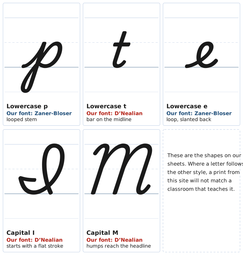
Five forking letters as this site draws them, and the style each follows.
The letters that fork
| Letter | Zaner-Bloser | D’Nealian |
|---|---|---|
| p stem | A loop at the bottom of the stem. The top stops at the midline. | A plain stick stem. The top still stops at the midline. |
| t bar | Crossbar sits slightly above the midline. | Crossbar sits on the midline. |
| e back | A loop with a straight, slanted back, like an l. | Curved back, like c and o. |
| a, c, d, g, o, q entries | Start at the top of the oval. No lead-in stroke from the baseline. | Every lowercase letter, including this set, starts with a lead-in stroke from the baseline. |
| Capital I | Starts with a curve up and over, ends with a short stroke to the right like T, F, G, and S. Does not connect. | Starts with a flat stroke written “backwards.” Connects to the next letter. |
| Capital Q | Ends with a tail under the baseline. Does not connect. | Looks like a 2. Connects to the next letter. |
| Capital L | Ends with a loop that sweeps under the next letter, so it cannot connect. | Also does not connect. |
| Capitals B, P, R | Start with a small curve from the midline. | Start at the headline. |
| Capitals M, N | Humps stop short of the headline. | Humps touch the headline. |
A few smaller differences show up once you look closely. Zaner-Bloser letters finish with a longer tail that rises to the midline; D’Nealian letters finish with a short flick, the “monkey tail.” A long Zaner-Bloser tail is how an l can start to look like a b. Capitals E and F begin with a short stroke down from the headline in Zaner-Bloser; D’Nealian starts those letters slightly lower. These are real, but they are easier to live with than a stick p in a school that teaches the looped p.
What stays the same
Most lowercase letters are built the same way in both styles. The i is a short curve with a dot, n is a hump, and o is a round oval drawn counterclockwise. Joins follow the same rules too; the how to write cursive guide walks through them.
If you are learning on your own, pick one style and stay with it for a month. Mixing the two in one word makes handwriting look uneven. Adults writing a signature can ignore the school split. A second grader cannot.
Joins are the other thing people worry about too much. Once the first letter’s ending is right, the next letter is usually the same in both styles. The part that usually goes wrong is where a letter starts, not the middle of it.
Which style this site uses
Every letter, chart, and worksheet here uses one typeface, the traditional US school cursive of Playwrite US Trad. It is a mix, not a pure copy of either method. The lowercase oval letters, p, e, and capital L follow Zaner-Bloser. Lowercase t, capital I, and capitals M and N follow D’Nealian. The figure above shows the five letters people notice first.
If your school teaches the other style, the sheets still work for practice; watch the letters listed in the table, where the two styles part ways. The alphabet chart, capital letters, and worksheets all use this same hand. Per-letter practice starts on the letter URL, not on a second worksheet path. Use this page to pick a style, then open the letter that was giving you trouble.
Sources
The Zaner-Bloser column was checked against Zaner-Bloser’s own published cursive formation charts (the Handwriting Practice Pack, Practice Masters 58 to 60 and 75 to 100) and its letter groupings page. The D’Nealian column follows published D’Nealian charts and teacher comparisons, which are secondary sources. When your child’s teacher hands out a chart, the teacher’s chart wins over this page.