Chart
Cursive capital letters
Cursive capital letters are written from the headline down to the baseline, and many start with a loop or curve instead of a straight line. Some capitals, such as G, Q, Z, and I, look very different from print. Some carry their last stroke into the next letter, and others end on their own.
Chart
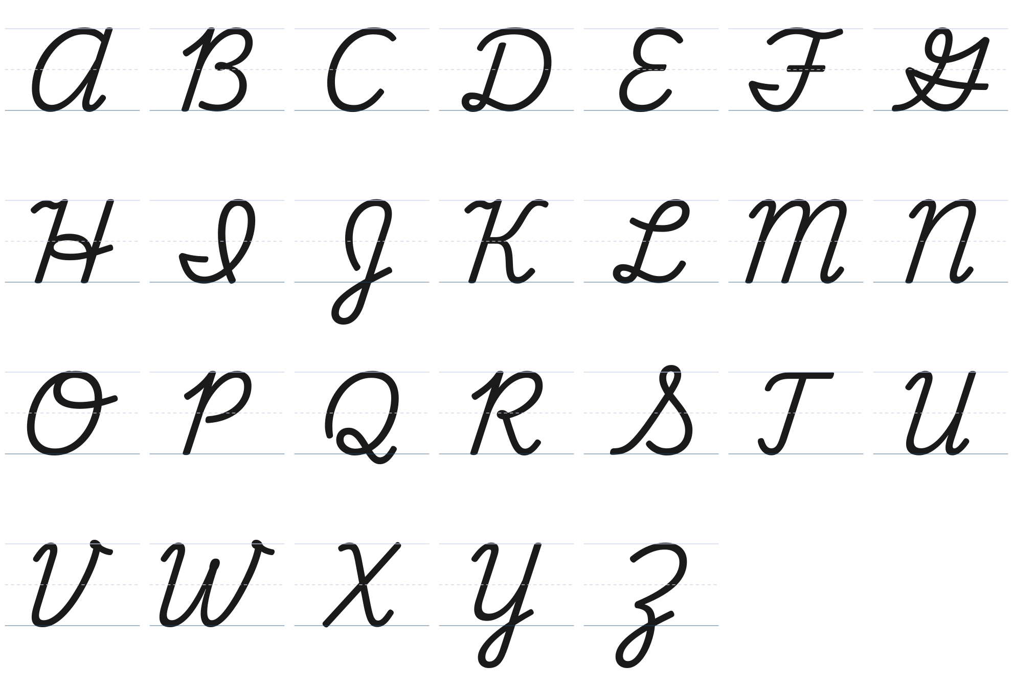
Cursive capitals A to Z.
The capitals that look least like print
G starts at the baseline, climbs to a small loop at the top, and finishes with a long stroke across the letter. I starts with a short stroke below the midline, curves along the baseline, and rises into a tall loop, so it can look like a J to someone who learned print. Q looks like a large cursive 2 with a small loop at the bottom left. Z is shaped like a cursive 3 with a loop that hangs below the baseline.
These four cause most reading trouble with old letters and cards. If you are decoding a grandparent’s handwriting, check them first.
Capitals that join and capitals that stop
In traditional cursive, some capitals finish with a stroke that runs straight into the next lowercase letter. Others end with a curl, a crossbar, or a flourish, so you lift and start the next letter fresh. Lifting after one of those is correct, not a mistake.
Join the next letter: A, C, E, J, K, L, M, N, Q, R, U, X, Y, Z.
Questions
Which cursive capital letter is the hardest?
Capital Q, G, and Z are the hardest for most learners because they share the least with the printed letter. Capital I is the most often misread.
Do cursive capital letters connect to the next letter?
Some do and some do not. In traditional cursive, A, C, E, J, K, L, M, N, Q, R, U, X, Y, Z join the next letter. B, D, F, G, H, I, O, P, S, T, V, W end on their own, so you lift before the next letter.
Should kids learn cursive capitals first?
No. Lowercase comes first because it makes up most of what you write. Capitals come after the lowercase families are steady.